When we bought our house almost three years ago, we knew one thing for certain – we were going to knock down the wall between the kitchen and the dining room. We live in a rancher built in the 1950s, so open floor plans were definitely not a thing back then.
Our oak cabinets were dated, we had very little counter space, and our Pepto-pink pocket doors needed to go! From a practical standpoint, the layout made it impossible for us to talk with our guests and prepare food at the same time.
We were ready for a change.

To complicate matters a bit, I’m incredibly indecisive when it comes to interior design. Selecting colors, styles, and layouts is NOT my thing.
When we were first coming up with ideas, I was convinced I wanted “warm” colors and a sunshine-y feel to the room – from countertops to paint colors. Oh, and I was adamant about a modern look. I told myself and anyone I talked to that the one thing I did not want was a modern look.
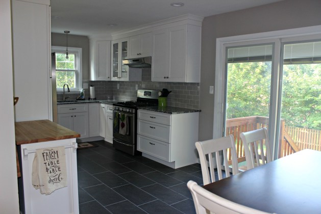
Sooo, naturally, we ended up with…dark gray porcelain tiles, a grey-beige paint color, white cabinets, nickel fixtures and a cool countertop with hints of plum – pretty much the exact opposite of what I thought I wanted!
Now that it’s finished, we love it!
Can I tell you how AMAZING it is to have counter space?? Soft-close drawers and doors? A pantry? Space to move? A place to entertain guests?
We used Craftmasters Remodeling to do the job, and they did pretty amazing work, making our (limited) vision into reality. We couldn’t be happier with how everything turned out 🙂
Here are some before and after shots of our old to *NEW* kitchen!


I know people like to know the particulars of renovation jobs like this, so I will do my best to let you know where different things came from:
- The Belmont kitchen island (with wheels!) is from Crate & Barrel.
- Appliances are Frigidaire Gallery and are from H.H. Gregg (Prez Day Sale!)
- Kitchen table is from Stebbins Anderson and has a bench that you can’t see in this picture 🙂


- Our floor tile is Galvano Charcoal Porcelain tile with pewter grout from Lowes.
- Paint color is Versatile Gray from Sherwin Williams.
- Backsplash is Tender Gray ceramic tile from Home Depot.
- Granite countertop is Bianco Frost from the Granite Outlet.


- It’s amazing to finally have some storage! Our cabinets are by Wolf and are the York style in white. We highly recommend the drawers for pots and pans and the rollout shelves in the pantry!
- We bought these drawer liners for our spice drawers from Amazon, so we could easily organize and access our herbs and spices.


Now, let’s take a look at some of the fun decorative stuff. We used greens and purples / plums as our accent colors, since our countertop has hints of plum in it and because I’m kind of in love with the color purple.
- Kitchen towels are All Clad and are from Bed Bath & Beyond.
- Kitchen sink mat and utensil holder are from Home Goods (love!).

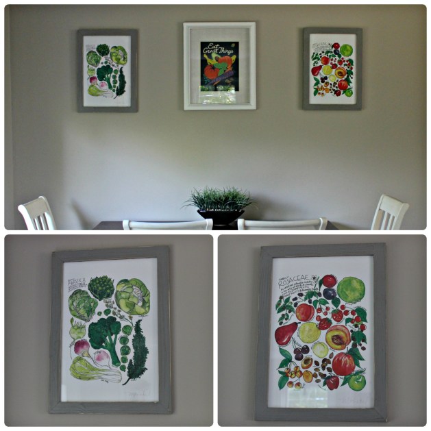
Our wall artwork is from Marcella Kriebel. She does BEAUTIFUL watercolor art. Speaking of the walls, we’re looking to update a different room in the house soon; we’re not sure which one yet but we know we want to radically change the walls in some way. One of the thoughts we’ve had is to get some peel and stick wallpaper as we’ve seen some really nice designs. But for now, we’re quite happy with the wall artwork we have as it does bring some character to the otherwise bare walls.
I have a few more prints from her that we will be framing and hanging in other rooms in the house. She’s based nearby in D.C. but ships everywhere. She’s also on Etsy, so check out her stuff.
The frames on the ends are a Vintage Stone Grey wood frame from The Rusty Roof on Amazon.

So, there you have it!
Rachel (& Bill’s!) Nourishing Kitchen is complete 🙂 I’m excited to see what will happen in our new space and look forward to sharing with you some new videos I will be filming using the island. I hope to host some smaller cooking events in our home, so those of you who are interested in having a more intimate and cozy class can join.


